Creating a scalable design system to reduce ambiguity and increase velocity
Establishing a modular design system in close partnership with engineers to guarantee component consistency, accelerate product velocity, reduce ambiguity, and provide a single source of truth for design and engineering.
Confidentiality Notice: Due to the proprietary and sensitive nature of my work in FinTech/B2B platforms at Raistone, all specific branding, sensitive financial data, and confidential text have been omitted, generalized, or anonymized in accordance with professional agreements. Full, unredacted details and further strategic insights are available for discussion in a live interview setting only.
Roles
Design System Architect
Visual Designer
UX Strategy Lead
Cross-Functional Partner
Responsibilities
System Architecture Definition (Atomic Model)
Component Library Design
Color Tonal Palette Creation
Component Prioritization
Design-Dev Alignment & Governance
Accessibility Compliance
Software & Methods
Figma
Zeplin
Material Icons
Material Design Bootstrap (MDB)
Atomic Design Methodology
Accessibility Audits
Intro
Hired as the first UX person, I recognized that rapid product development would quickly lead to unmanageable technical debt. I immediately initiated a partnership with the Senior .NET Developer to build a centralized design system in parallel with the Client Portal's research phase. Our shared goal was simple: guarantee standardization and consistency to accelerate the future speed of development. This initiative directly supported the successful launch of Raistone’s Client Portal.
Discover
Proactive Debt Prevention
Since the Design System was initiated at the very beginning of the Client Portal project, the we didn’t have to audit an existing chaos, but instead proactively forecasted and prevented inevitable technical debt. Without a centralized resource, we faced three immediate risks that would stagnate future velocity:
Operational Inefficiency
Engineering time would be wasted on manually recreating UI elements instead of focusing on critical business logic, directly limiting the speed of product development.Systemic Inconsistency
Every new feature would be built from scratch using fragmented methods, guaranteeing inconsistency and leading to expensive design variations across platforms.Future Misalignment
The new Client Portal would eventually become misaligned with the developing Core Processing Engine and existing corporate brand, resulting in a fragmented and confusing user experience.
Strategic Solution: Technical Alignment
The solution began with a strong partnership with the Senior .NET Developer to establish a unified standard:
Shared Foundation
We aligned the system on Google Material Design principles to establish a common language for component states and behaviors. This strategic choice ensured immediate technical feasibility.Technical Partnership
This mutual investment led to a commitment: to build a component library in Figma that mirrored the technical structure of Material Design Bootstrap (MDB), establishing the single source of truth for both design and code. This proactive alignment guaranteed consistency and streamlined communication from day one.
The strategic objective was to prevent technical debt and accelerate product velocity by establishing a centralized, governed source of truth.
Define
I started by establishing the core architectural rules necessary to ensure the system was scalable, accessible, and technically aligned with development.
System Architecture and Modularity
The system was designed from the ground up for modularity and reusability, minimizing future technical debt and time spent on expanding the design system.
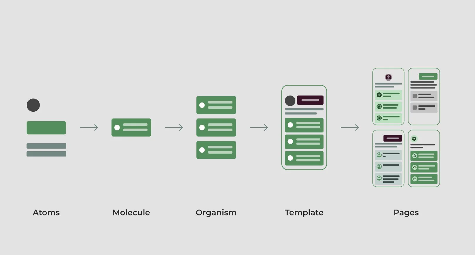
Atomic Design
I structured the Figma library using the Atomic Design Methodology for maximum component reusability and clear categorization.

Tokens Foundation
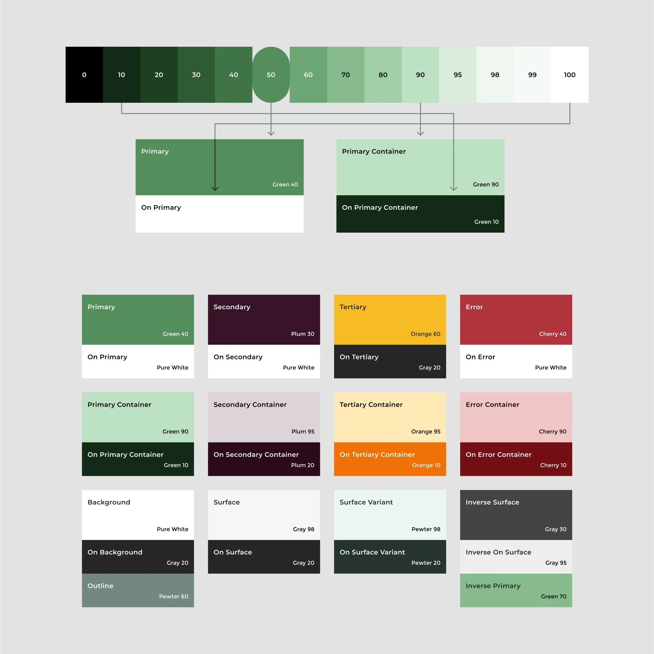
To future-proof the system and enforce consistency across code and design (even before native Figma token features were available), I implemented a systematic naming convention for all color, text, and elevation styles, effectively establishing a token-based foundation.
Strategic Color and Branding Alignment
Defining the color palette required a strategic hybrid approach to balance existing brand guidelines, new corporate website design decisions, and technical best practices.
Refining the Brand: I merged the original brand guidelines with a refined palette from the third-party web designers (e.g., swapping a strong purple for a dark plum and darkening the green). This guaranteed the Client Portal would maintain brand cohesion with the new corporate website when launched.
Building the Tonal Palette: To ensure systematic consistency and future flexibility, I implemented the Material Design color system. This solid foundation immediately guaranteed accessibility compliance and created a dynamic scheme where:
Future-Proofing: Color roles could be interchanged to instantly create distinct UI themes for other platforms, like the Core Processing Engine or products in the roadmap, without changing the underlying components.
Consistency: All colors were rigorously tested to ensure proper contrast and systematic consistency across the entire platform.


Foundational Elements
With the system's core architecture defined, I moved on to establishing the elemental components:

States and Layers
Defined component states (hover, disabled, etc.) based on Material Design principles, ensuring consistent functionality and clear visual feedback for the user.

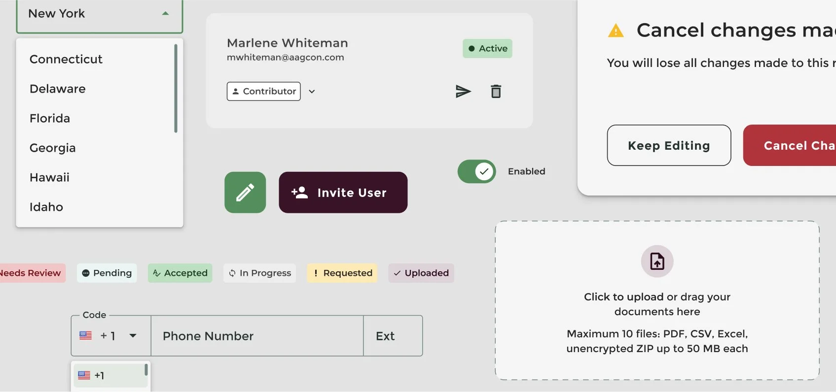
Base Components
I quickly defined base components (buttons, fields, checkboxes) and their essential states (hovered, focused, pressed, disabled).

Component Pragmatism
Leveraging on Material Icons for the icon library, this pragmatic decision prioritized function and speed over a custom icon set, conserving bandwidth for more complex components required by the Client Portal's critical workflows.
Develop
Constraint Management and Collaborative Iteration
The development was a cyclical process focused on translating architectural rules into working components, ensuring fast adoption by the engineering team.
Targeted Efficiency
This alignment allowed me to focus design bandwidth exclusively on the most critical and complex components required for launch (menus, tables, stepper), maximizing impact where the system needed it most.
Pragmatic Co-Creation
When MDB lacked necessary components (e.g., Upload Widget), I co-created solutions directly with the developer, constantly balancing ideal UX with practical development time.
Strategic Alignment
The core constraint was the engineering team's choice of Material Design Bootstrap (MDB). I leveraged this by prioritizing Figma components that perfectly aligned with MDB documentation, guaranteeing a direct code match and preventing early technical debt.
Responsive Mandate
I successfully advocated for responsive design and QA testing across all viewports by presenting statistics showing that approximately 50% mobile traffic, adding crucial long-term value to the system.
Design
Specifications and Ongoing Maintenance
The final phase focused on turning the design structure into a usable, living resource by setting clear rules for how the system would be used and kept up to date.
Specifications as a Living Contract: All components and styles were documented in Figma and exported to Zeplin. This documentation provided specs, expected behavior, and established a key rule: any component not covered defaulted to the standard MDB library, which removed confusion and saved significant time. It served as the single source of truth for both developers and QA specialists.
Iteration and Future-Proofing: Design became a continuous service, not a single handoff. We set up an maintenance process where updates to the design system were driven by new requirements and QA feedback. This required constant collaboration with the developers to successfully balance usability against practical development costs, ensuring the system remained efficient and immediately useful for scaling the platform.


Component Spotlight: The Configurable Stepper
The most complex challenge was designing the Onboarding Stepper component—the advanced vertical progress bar for the application flow. This component served as a critical test of the system's ability to handle business logic while effectively managing the most complex workflow in the Client Portal, showcasing the following features:
Configurable Workflows: Created with sub-steps and customizable user journeys that adapt based on the user's entry point, it demonstrated the system's capacity to manage complex, dynamic workflows.
Intuitive Interaction Design: The Stepper is a crucial piece of interaction design that actively guides the user through the application flow, ensuring clarity and driving high completion rates in the Onboarding Module.
Holistic System Construction: Built by relying entirely on the underlying Design System's foundational components (color, typography, and states), which ensured the Stepper was instantly consistent with the rest of the platform experience.


Conclusion
Summary and Measurable Impact
The launch of the Design System was a success in proactive product strategy. By establishing a unified language and a shared, reliable resource before development began, we eliminated the technical debt that would have otherwise accrued. The result was a measurable acceleration of product development velocity, evidenced by:
Proactive Waste Prevention: 30% Time Reduction
This efficiency gain represents the estimated time we saved by eliminating ambiguity. By having documented component specs and usage rules in Zeplin ready at handoff—before development even began—we cut out the typical back-and-forth Q&A that historically delays sprints in unstructured environments.
Design Velocity: Building Prototypes in Days, Not Weeks
The ready-to-use Figma component library eliminated manual component checks and rebuilds. This allowed the design team to build interactive prototypes in a few days instead of the multi-week effort, drastically improving our ability to quickly validate new concepts.
Organizational Agility: Engineers Committing Code Within Days
The comprehensive documentation and organized component library served as immediate training material. New developers could confidently commit code and pull stories within days of joining the team.
Takeaways
The project provided essential lessons in organizational efficiency, technical collaboration, and strategic design:
Partnership is the Core Asset
Success hinged entirely on the clear, early alignment and shared efficiency goals established with the Senior .NET Developer. Trust and co-creation are prerequisites for any scalable design system.
Define the Constraint First
The technical platform (MDB) dictated the design system's foundation and prioritization. Viewing the engineering toolset as a design constraint, rather than a limitation, allowed for practical, quick, and efficient system delivery.
Architecture Guarantees Long-Term Value
The system's foundations and complex components were designed for adaptability. Building reusable architecture that anticipates future requirements ensures the system's longevity and scalability.
Proactive Leadership Earns Organizational Trust
The decision to build the Design System before development began was a demonstration of foresight that quickly established trust with executives and senior leadership, earning buy-in for future UX initiatives.
System Documentation as a Living Contract
The documentation in Zeplin was treated not as a static handoff, but as an ongoing agreement between Design and Development. Effective governance requires continuous iteration and clearly defined component specifications.
Practicality Over Perfection
Simplicity and consistency must always be prioritized over time-consuming customization. Our choice to use Material Icons and adapt a hybrid color system ensured rapid system delivery.
See the System's Impact:
The Client Portal
The successful delivery of the Client Portal was enabled by the architecture and governance defined in this design system.